Goodness By Design logo
Branding & Packaging

Hit the ground running

Runner Bar

A running nutrition brand built from the ground up - identity, packaging, and a brand world designed to go the distance.

Branding

Packaging

Three Runner Bar flavours - Espresso Charge, Berry Boost and Matcha Zen - laid flat on a teal background.

Overview

Runner Bar was born out of frustration with a market full of artificial ingredients and empty promises. Co-founders Nubar and Anna set out to build a performance bar made from real, functional ingredients, built specifically for runners. The brand needed to match that ambition - credible enough to compete, authentic enough to feel genuinely at home in the running community.

Runner Bar was born out of frustration with a market full of artificial ingredients and empty promises. Co-founders Nubar and Anna set out to build a performance bar made from real, functional ingredients, built specifically for runners. The brand needed to match that ambition - credible enough to compete, authentic enough to feel genuinely at home in the running community.

Role

The project grew from a brand identity commission into a full creative partnership covering logo design, wrapper packaging across three flavours, outer cartons, a premium welcome box, a full-page magazine ad, sticker sheet, and social assets.

The project grew from a brand identity commission into a full creative partnership covering logo design, wrapper packaging across three flavours, outer cartons, a premium welcome box, a full-page magazine ad, sticker sheet, and social assets.

Challenge

Runner Bar needed to feel grassroots and community-driven while also being premium enough to compete in a crowded market. Everything had to carry that balance.

Runner Bar needed to feel grassroots and community-driven while also being premium enough to compete in a crowded market. Everything had to carry that balance.

Solution

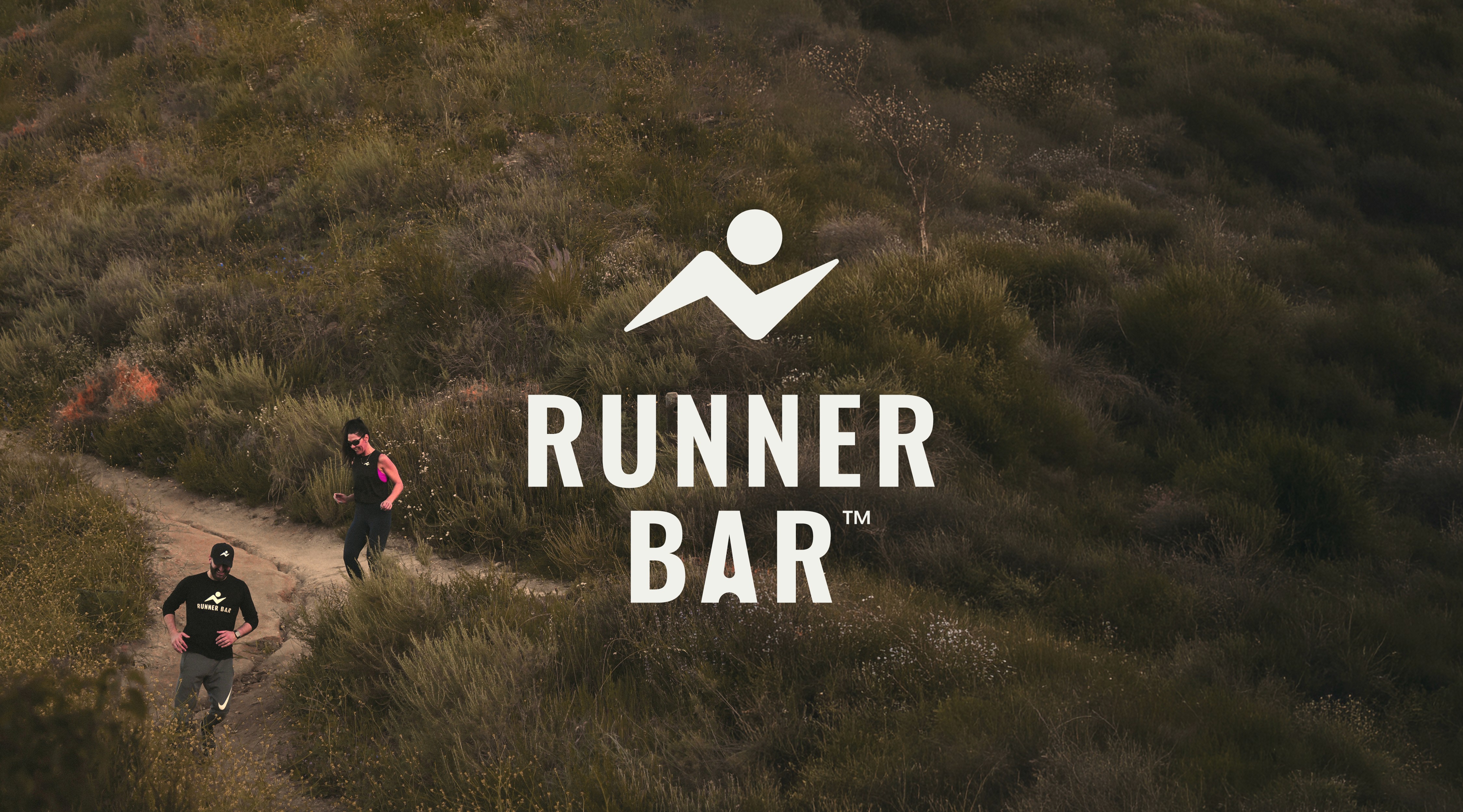
The logo layers three ideas into one mark - a bolt referencing the electrolytes in every bar, a runner in stride, and a mountain path rising toward a sun - with a subtle droplet in the A of BAR as a quieter nod to hydration. That thinking carried into the wider brand world too, with a hidden Runner Bar logo tucked into the mountain illustration inside the welcome box. Can you spot it? The packaging uses flavour-led colour blocking across three variants, with outer cartons that double as shelf-ready displays when a perforated panel is removed. The brand's first major statement came with a full-page ad in the Badwater 135 race magazine - 135 miles through Death Valley, widely considered the world's toughest foot race. Headlined "Built for the long run," it was a deliberate signal of intent.

The logo layers three ideas into one mark - a bolt referencing the electrolytes in every bar, a runner in stride, and a mountain path rising toward a sun - with a subtle droplet in the A of BAR as a quieter nod to hydration. That thinking carried into the wider brand world too, with a hidden Runner Bar logo tucked into the mountain illustration inside the welcome box. Can you spot it? The packaging uses flavour-led colour blocking across three variants, with outer cartons that double as shelf-ready displays when a perforated panel is removed. The brand's first major statement came with a full-page ad in the Badwater 135 race magazine - 135 miles through Death Valley, widely considered the world's toughest foot race. Headlined "Built for the long run," it was a deliberate signal of intent.

Runner Bar logo overlaid on an aerial shot of two people trail running on a hillside.

Complete brand identity and packaging system

Three ideas, one logo mark

Featured in the Badwater 135 race magazine

Runner Bar Berry Boost full-page magazine ad reading "Built For The Long Run" in an open running magazine.

Jon was professional, clear in his communication, and highly skilled in his craft. The final design gives our brand a strong foundation and allows us to present our product with confidence as we move toward launch. The final artwork exceeded our expectations.

Jon was professional, clear in his communication, and highly skilled in his craft. The final design gives our brand a strong foundation and allows us to present our product with confidence as we move toward launch. The final artwork exceeded our expectations.

Nubar & Anna
Open Runner Bar mailer box with an illustrated mountain trail runner scene printed inside the lid.
Collection of Runner Bar branded stickers on a teal background, including logo, trail scene, and slogan designs.

here's some other projects you might like.