Goodness By Design logo
Retail Design
Retail Design

Design that sells off the shelf

Arrowtown Drinks

A freestanding display unit that gave a growing vodka soda brand a bold retail presence, and tripled their rate of sale in two weeks.

Retail
Print

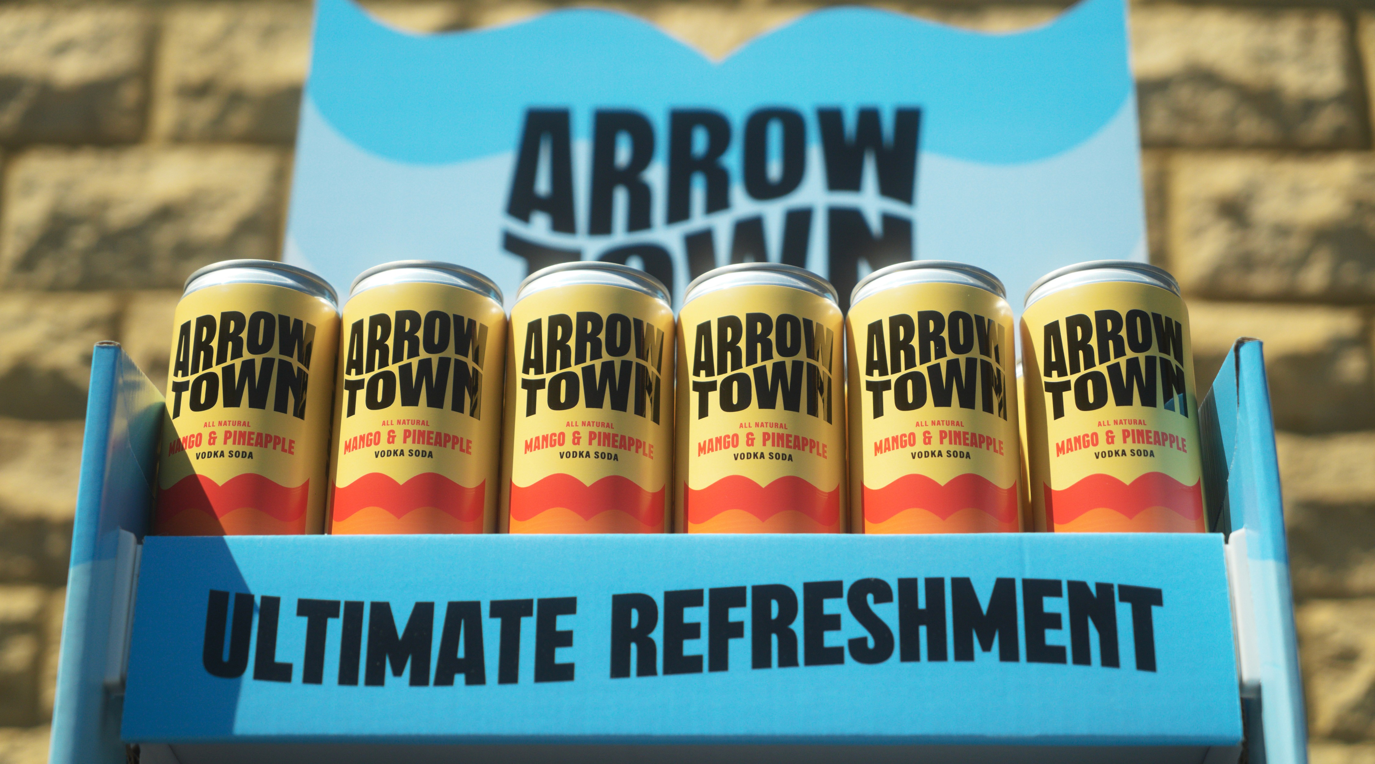
Six Arrowtown Mango & Pineapple vodka soda cans in a blue retail display unit outdoors.

90 stores, nothing to fill them with

Arrowtown Drinks had secured a genuine opportunity: a freestanding display unit across 90 Co-op stores. They knew the rough dimensions, that it needed to hold four flavours, and that it would be open on three sides, but beyond that, no clear idea of what the unit itself should actually be. The brand identity was already established by Brandon Consultants, giving a brilliant foundation to build from.

Arrowtown Drinks had secured a genuine opportunity: a freestanding display unit across 90 Co-op stores. They knew the rough dimensions, that it needed to hold four flavours, and that it would be open on three sides, but beyond that, no clear idea of what the unit itself should actually be. The brand identity was already established by Brandon Consultants, giving a brilliant foundation to build from.

More than an off-the-shelf shape

The early instinct was a standard rectangular top, functional, safe, and exactly what you'd expect from a display unit. But Arrowtown was going up against some of the biggest drinks brands in the country, in a category (vodka soda) plenty of shoppers wouldn't immediately recognise. A standard shape wasn't going to earn a second look, and the unit needed to do two things at once, introduce an unfamiliar brand with real presence, while making it obvious what the product actually was.

The early instinct was a standard rectangular top, functional, safe, and exactly what you'd expect from a display unit. But Arrowtown was going up against some of the biggest drinks brands in the country, in a category (vodka soda) plenty of shoppers wouldn't immediately recognise. A standard shape wasn't going to earn a second look, and the unit needed to do two things at once, introduce an unfamiliar brand with real presence, while making it obvious what the product actually was.

Structure borrowed from the brand itself
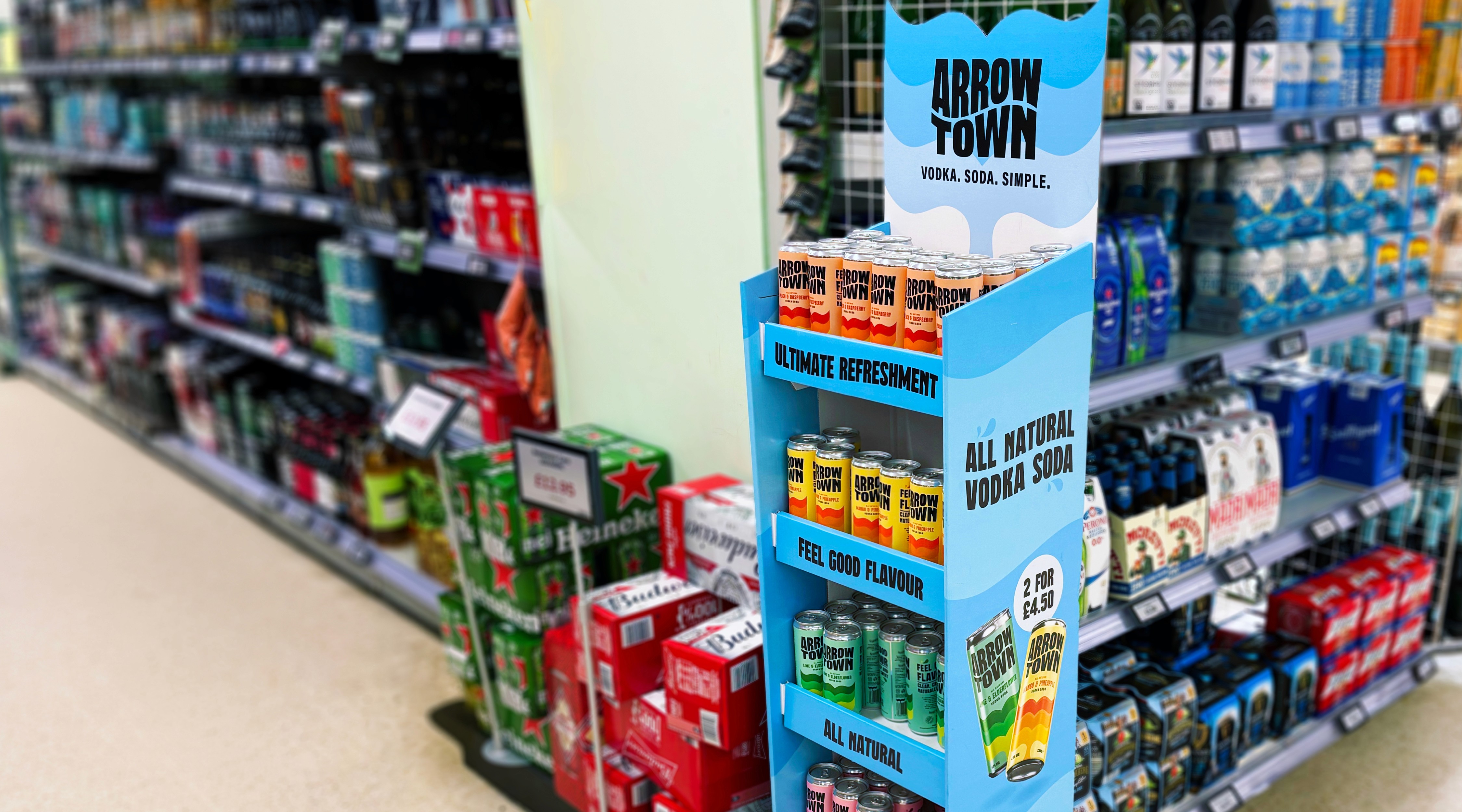
The shift came from a simple realisation: the whale tail already sitting in Arrowtown's packaging didn't have to stay flat on a can, it could become the structure of the unit itself. Die-cutting the backboard to that shape gave the display an unmistakable silhouette, different from anything else standing on the shop floor, and opened up layered colour through the cut-out rather than one flat panel. What started as an off-the-shelf rectangle became something with real character.

The shift came from a simple realisation: the whale tail already sitting in Arrowtown's packaging didn't have to stay flat on a can, it could become the structure of the unit itself. Die-cutting the backboard to that shape gave the display an unmistakable silhouette, different from anything else standing on the shop floor, and opened up layered colour through the cut-out rather than one flat panel. What started as an off-the-shelf rectangle became something with real character.

Arrowtown branded floor-standing display unit stocked with multiple flavours in a supermarket aisle.

Built to work from every angle

Bringing the shape to life

The whale tail motif carries through in the finer details too, waves layered in as texture rather than left as flat colour, adding depth to the die-cut structure. Callouts run down the front shelves to keep key credentials visible at a glance, and a promotional offer sits on the side to draw in shoppers who've never tried Arrowtown before.

Selling even without stock on shelf

Large-scale 3D renders of the cans appear on the sides, giving the product an active, in-use feel rather than a static shelf shot, and making sure the drink itself stayed visible even on days the shelves weren't fully stocked. Within the first two weeks of going into store, the founders reported the rate of sale had tripled.

Tripled rate of sale in two weeks

Live across 90 Co-op stores

Bold retail presence for a growing brand
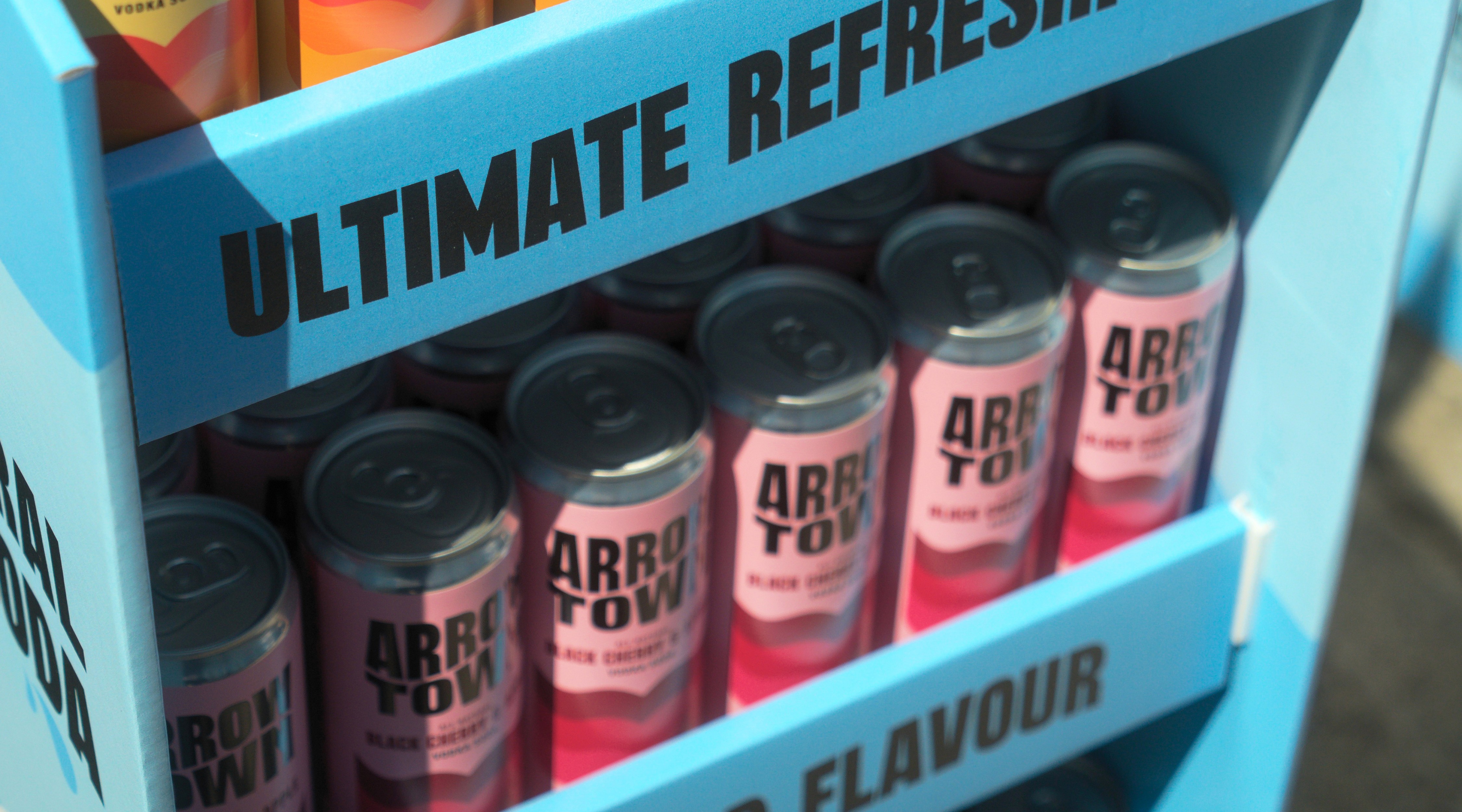
Close-up of Arrowtown Black Cherry vodka soda cans stacked in a blue retail display shelf.

From the outset Jon understood our needs and ambitions. His eye for detail and expertise really helped elevate the final design and bring my vision from a vague brief to life. The early feedback to the FSDUs has been amazing and they're now popping up in shops across the country!

From the outset Jon understood our needs and ambitions. His eye for detail and expertise really helped elevate the final design and bring my vision from a vague brief to life. The early feedback to the FSDUs has been amazing and they're now popping up in shops across the country!

James Smith, Co-Founder, Arrowtown Drinks
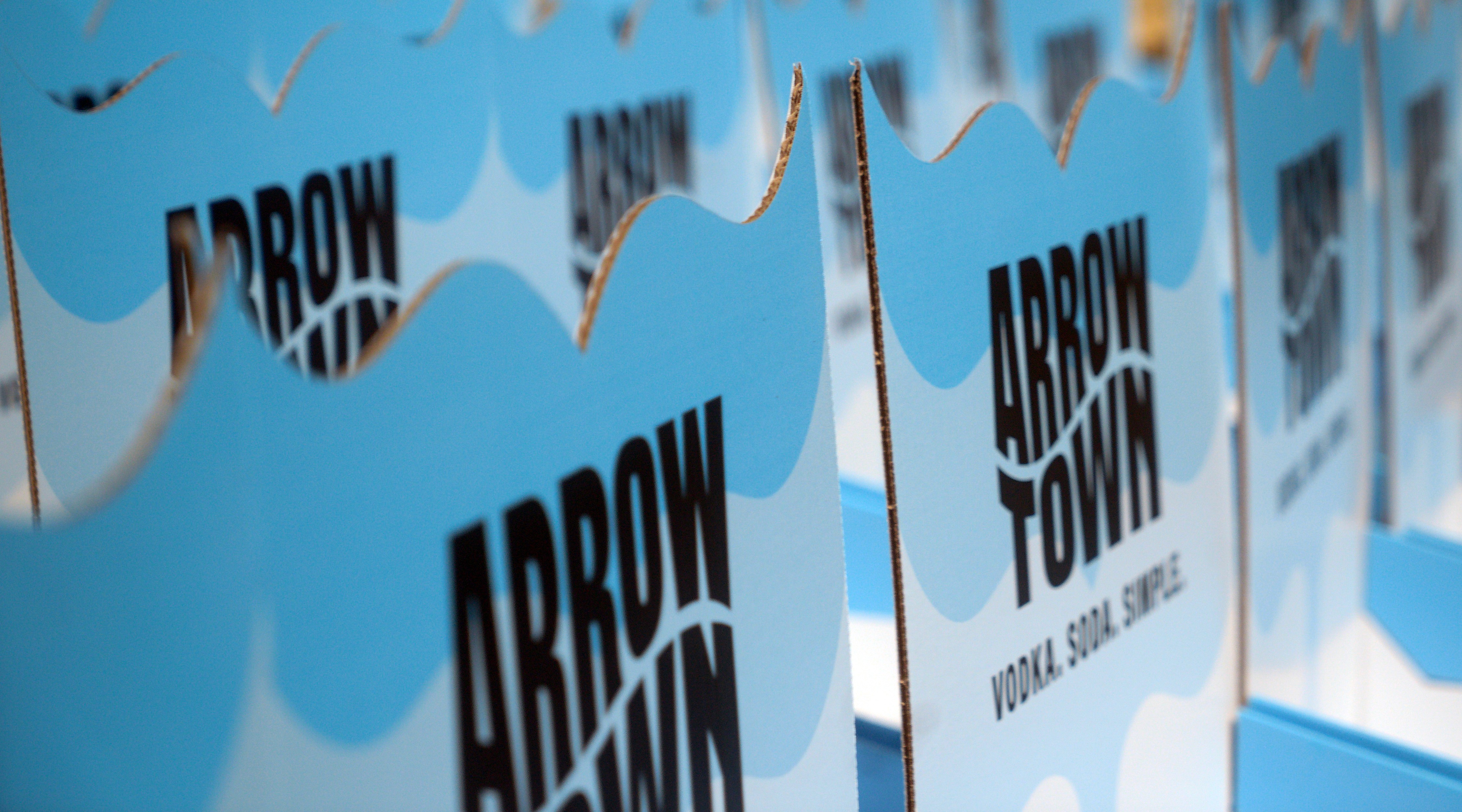
Row of Arrowtown branded blue cardboard display units showing the logo and cloud design, seen at an angle.
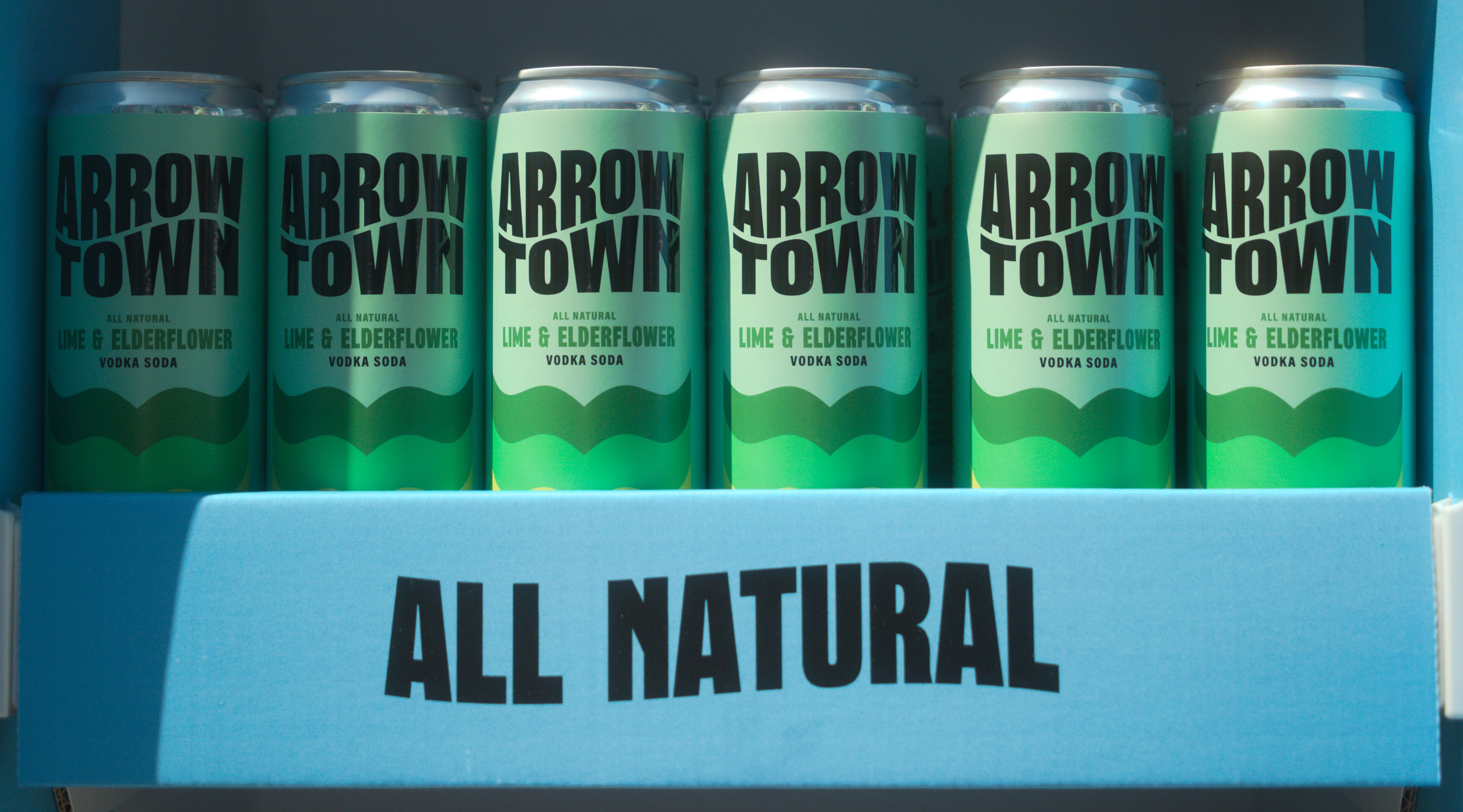
Six Arrowtown Lime & Elderflower vodka soda cans in a blue display shelf labelled "All Natural".

here's some other projects you might like.